
App Reviews
Cash App Mobile App Review
5min Read
We’re obsessed with mobile apps here at Sneakers Apps and so every two weeks someone analyzes a mobile app from top-to-bottom and presents their findings to the company. In this Cash App mobile app review we take a look at the fastest growing social media app on the planet: Cash App.
We start out with their app store listing to better understand how they are marketing their app to users. Then we analyze app sign-up, onboarding, navigation, and features to see if the app is easy to use and intuitive. We also dive into whether the app supports things like accessibility and dark mode. Last but not least, we take a look at their website to see how well their website ties together their brand and their app/service.
App Store Listing Analysis
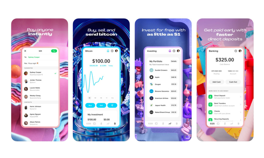

The Cash App pops in the app store visually. The illustrations behind iPhone previews are catchy and a great addition to the listing. What’s interesting is the high design in the app store doesn’t translate directly to the mobile product. We, like millions of other others, hone in on the simplicity of the app from the jump. When planning an app store listing there’s tons of ways to boost a product’s presence. Cash App does this very well. All apps should use their store listing as one of their many billboards. Cash App doesn’t skimp on the app description either. At the time of this analysis the product and marketing teams make sure to call out how the app is SAFE, FAST, FREE, in addition to highlighting key features.
In order for a user to install your app, they have to start somewhere. Put care and planning into your listing like Cash App does.
App Tour Analysis
Surprisingly, Cash App doesn’t currently offer what we call an ‘App Tour Analysis’. There’s zero overview once you install and run for the first time. Typically the more complex an app is the higher likelihood you’ll find a tour. Tours often include different lightboxing, coaching cards, or tool tips to introduce key actions or settings that other users have found useful.
The key features in the app are front and center after the user has onboarded. Therefore, it’s not a drawback to bypass this option and Cash App doesn’t lose any points here. Beauty through simplicity.
Sign In / Sign Up Analysis
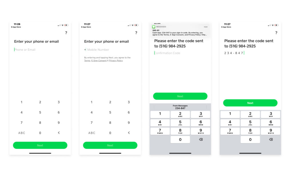
The Cash App has a simple, streamlined signup process. We like how they use one field to double for email or phone number entry. Reduces the number of screen options to navigate. Simple, but effective!

Onboarding
A finance app… this must have a ton of Know Your Customer (KYC) red tape to jump through to use it, right? Wrong.
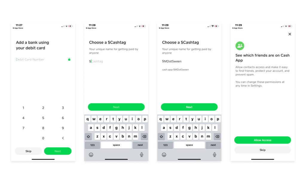
The onboarding process is seamlessly baked into sign-up where the user provides either an email or a mobile phone number, a bank/debit card, and a user name (a $cashtag). This is also the first time we came across the request to access/share our contacts, a common growth tactic among P2P (and other) products.
We chose to skip connecting our contacts here which then landed us on the main screen for the first time. Sign up & Onboarding, done!

App Tutorial
The Cash App doesn’t present any onscreen tutorials for users. You’re pretty much on your own here to figure it out.
App Navigation Analysis
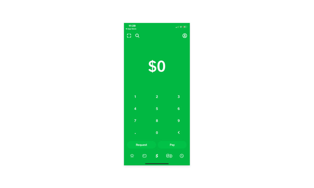
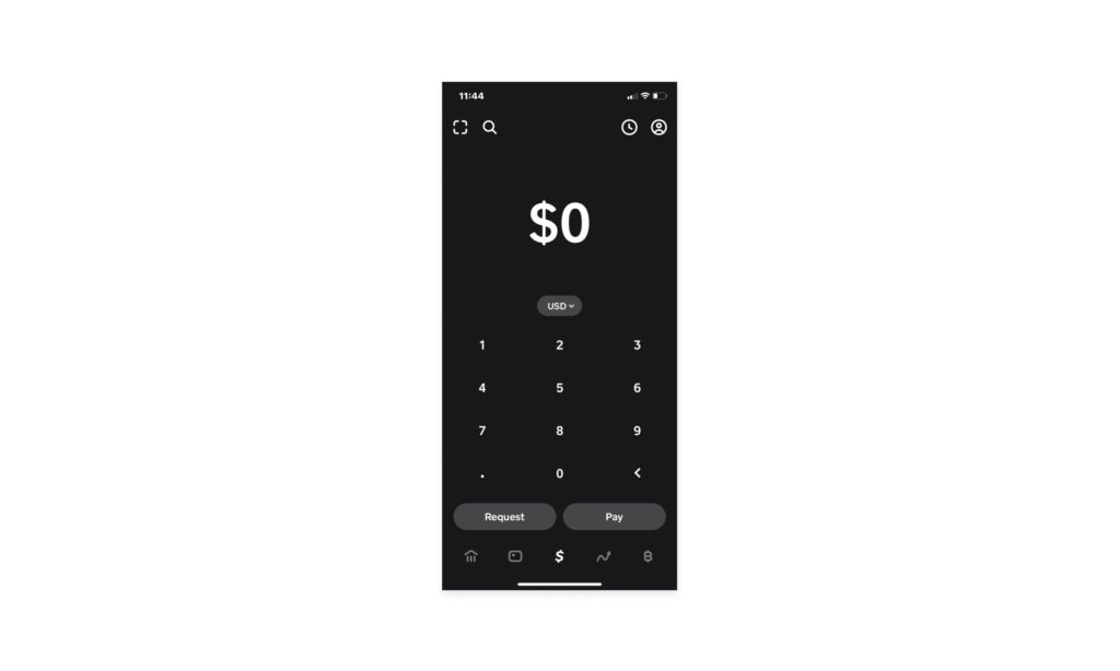
Cash App includes a 5 icon tab bar at the bottom of the screen. This allows users to quickly switch between main areas of the app. The tabs are as follows:
- Home – The main screen for paying or requesting money from another user
- Debit/Card – an offer to apply for a Cash App offered ‘card’
- Cash – your balance that you can use transactionally with other users
- Stocks – buy/sell individual stocks
- BitCoin – buy/sell the crypto currency
In addition to the tab bar from the main screen the user can also trigger:
- Scan (a QR code)
- Search (for other users)
- Profile (his/her/their own user profile)

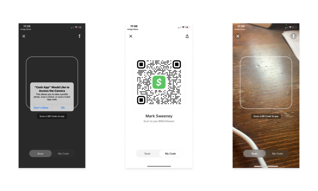
Here’s what the scan looks like. The app first requests access to the device camera and then the user can toggle through sharing his/her/their QR code and $cashtag with another party, or using the device camera to scan another QR code and $cashtag combo to transact.

Request & Pay
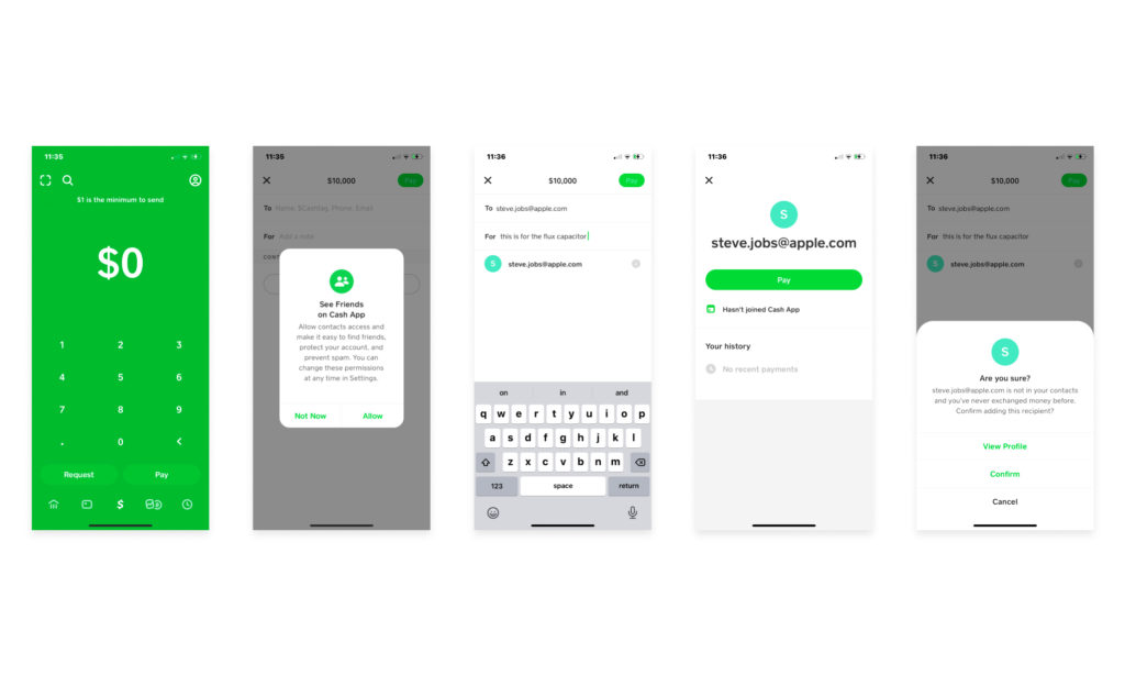
Sending someone money or having them send you money is a breeze with the Cash App. If you’ve ever used Venmo then you’ll be right at home. Right from the apps’ main home screen, you can jump right into sending someone money. Or, click on the upper right hand corner to scan someone’s barcode or have them scan yours.

Dark Mode
We really like how the Cash App supports dark mode. Given that the main color of their app is a non-white color such as green it was hopefully pretty easy for them to support this feature. Dark mode in the Cash App is completely determined by your phone’s system settings. There is no way to change this in app.

Accessibility Analysis
The Cash App unfortunately does not seem to support accessibility very much if at all from our brief testing. If anyone from the Cash App is reading this and we’re wrong please do let us know. :/
Push Notification Analysis
The Cash App lets you get a little granular with the types of notifications you can receive. We always appreciate when apps do this. You can enable/disable these types of notifications:
- Cash Team Notifications
- Reward Status Updates
- Stock Updates
- Bitcoin Updates
Apple Watch
The Cash App has an accompanying Apple Watch app that makes it easy to see and pay incoming requests. Cool beans.
Privacy Settings
The Cash App makes it easy to manage the essential security settings for a Fin Tech app. You can require Face ID to transfer funds, control who can find you on the app, and control whether the app syncs your contacts. Simple and to the point. We like it.
Website
By the looks of the Cash App website, you’d never thing it was a Fin Tech payments app, but alas they’ve done some really creative work on their site without sacrificing readability and usefulness of content. Great use of animations, clean and simple copy, and some wonderful branding make for an outstanding site. The site also translates beautifully to mobile.
Cash App Mobile App Review Wrap Up
As a result of our Cash App Mobile App Review, we give the Cash App a 9.6 out of 10.
What did Sneakers Apps like?
One of the things that stands out to us here at Sneakers Apps is that the Cash App really goes out of its way to have a unique visual look and feel compare to most stodgy Fin Tech apps. We appreciate the time and effort they put into this and also under the hood it feels like they have some top-notch engineering powering the app.
What did Sneakers Apps not like too much?
There’s really not much we didn’t like. Cool branding with a simple, clear UI and use case makes for a stellar app.
What would Sneakers Apps do differently?
Given how much we use Venmo and how we are typically letting someone scan our barcode to send us money, it would be interesting to let users choose barcode scanning as their default home screen option via the app’s settings.
